White Cube Space London
When visiting White Cube in London I wasn't as inspired by the art work itself I was more interested in the way the paintings were displayed as even the scattered paintings always have another painting in line with it.


When going down Cork Street in London there were a few interesting little galleries where artists sell their work, it was interesting to see the prices and work that was being sold by working artists.
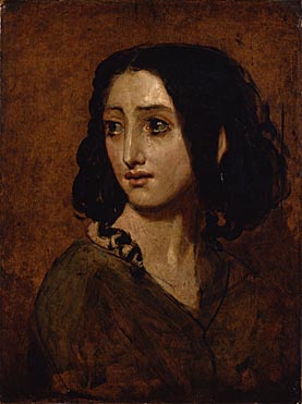
Below is a oil on panel painting by Ishbel Myerscough, Untitled (head and shoulders), the detail in the painting was amazing and found that there is something interesting about not being able to look at the persons face in a portrait.

Below is an large oil on canvas, Marsyas by Tai-Shan Schierenberg

National Portrait Gallery
Giovanni Battista Moroni - A knight with his jousting helmet
I was interested in the layout with this painting as the knight is not wearing any of his armour and only has contact with his helmet by leaning his hand against it whilst the rest of the armour is carelessly scattered on the floor amongst his feet.

Giovanni Battista Moroni - The tailor
With this painting I was looking at the link of title and painting, the title the tailor indicates a job title, within the painting itself the man is holding a pair of scissors as well as an item of clothing making it very apparent the man's purpose and job role within the painting, however the man is also very finely dressed and looks the viewer in the eye makes which makes the viewer question the painting more so that there may be more to it than the portrayed man being a taylor.

Paul Cezanne - Old woman with a rosary
I was drawn to this painting because of the way the woman portrayed blends into the darkened background, her eyes are also hollow and blank with no life in them similar to Rembrant's portraits. However in this image the woman is blanking gazing down there is also a sign of hope and religion when the woman is clutching some rosary beads. The blank eyes is a similar idea I had with my own work, however I did not paint them black and left them the colour the same my background.

Gustave Moreau - St George and the dragon
When looking at this painting it is apparent that there is narrative and a story behind the image with symbolic images, this is a similar idea I had with my own work, however I didn't want to be as littoral with demonstrating narrative within my paintings.

Degas - Princess Pauline De Metternich
I was really interested to see Degas's painting with the wallpapered background as that was one of the ideas for my own paintings with the dripping background, I may repaint over the dripped background and paint something similar inspired by Degas's painting and also William Morris's wallpaper designs.

Vilhelm Hammershoi - Interior 1899
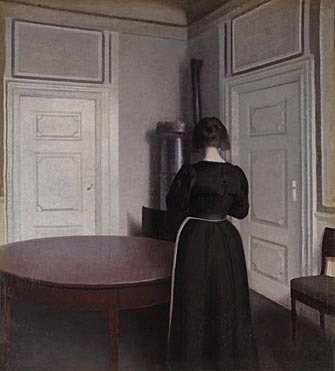
Vilhelm has used the space around the woman to become part of the portrait creating the image to not be all about them woman portrayed, he has also shown the woman with her back to the viewer which makes me question why she is looking away making the image visually interesting allowing an element of narrative.
William Etty - Portrait of Mlle Rachel 1841-5
Etty's portrait of this woman I find to be very interesting as he has captured an emotional facial expression facing away from the viewer. Etty has also drawn an outline for the woman's shoulders and clothing which begins to blend into the background. This is a similar effect done by Michael Borreman and how I have also painted my own portraits, I think this allows the viewer to focus mainly on the portrayed person's face rather than the rest of the image.
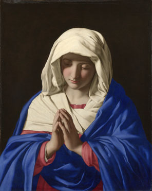
Sassoferrato - Virgin in prayer
The dark black background in this painting pushes the portrayed virgin into the foreground allowing a 3D effect.
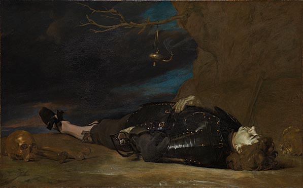
Unknown Italian Artist - A dead soldier
This portrait by an unknown Italian artist has an interesting layout and symbolic imagery of a skull relating to death which is also being portrayed by the dead solider before the viewer, the artist has also used the use of colour within the oil paints to demonstrate the health of the soldier by painting his skin sucked of life and colour to resemble a greyish/greenish tint.
Lucas Cranach the Elder - St Genevieve and Apollonia
Cranach's painting I found to be similar to Jan Van Eyck's 'Adam and Eve' cathedral portrait which is an artists I have previously been looking at.

National Portrait Gallery Contemporary Artists
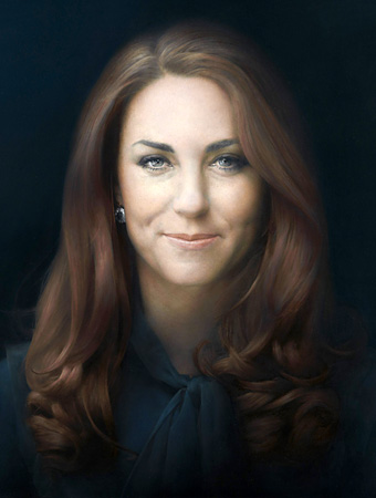
Paul Emsley - Kate Middleton
Emsley paints a blackened background similar to Sassoferanto creating the portrayed person's figure and features to be pushed forward. It was interesting to read that 'His subjects are frequently located against dark background and emphasize 'the singularity and silence of the form'.
Susan Aldworth - The portrait anatomised
Aldworth's work is interesting to see a different way of portraying a person by instead of creating a traditional portrait she uses negative colours such as black and white and sectioning off the parts of the body.


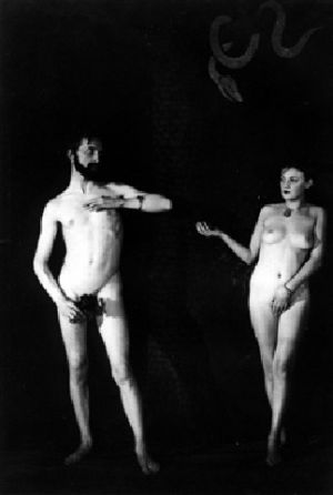
It was interesting to see adam and eve demonstrated through photography in Man Ray's exhibition after seeing Jan Van Eyck's 'adam and eve' as they are closer together unlike Man Ray's as he demonstrates them distantly creating hand gestures.
Craigie Aitchison - Self portrait
Aitchison attacked the painting in an attempt to destroy it after he was given a compliment remarking his work was 'flattering'. What I found interesting about this painting was the scratch marks were aimed over the face, I felt as though the scratches related to the cracks I had purposefully made with my own canvases.

Tate Britain
Kurt Schwitters - Untitled (Lovely Portrait)
Schwitters uses a range of bright colours and gestural marks within his portrait creating different shapes, form and tonal factors. These bright colours is an element that I haven't used within my own portraits however for Scwitters painting this really works as it highlights what may be important elements of the paintings.

Schwitters - Untitled (Portrait of Harry Pierce)
It is interesting how Scwitter's has used the portrayed person's interest and their own current activities as a background within the painting. In this case Pierce was creating landscape gardens. This idea of using a personal element to enlighten a portrait is something I am going to keep in mind for future portraits of my own.

Schwitters - Untitled portrait of George Ainslie Johnson`
When viewing this painting it was really interesting reading why, how and his thoughts on creating the portrait: 'Schwitters painted Doctor Johnston's portrait in exchange for treatment. He wrote, "I am painting my doctor, Dr Johnston in return for the pains he took to save my life. Now he does not like to sit foe me so I play chess with him. That means a double effort...... the problem is: shall I let him win, as his expression is then friendly, but people may think I am a bad chess player, as the game is pictured in the painting, or shall I let myself win, but then his expression is unfriendly and people think I am a bad painter." - it was interesting to see the thought process of a successful artist and how there are always hurdles with the portraits you paint with the portrayed person which does not include the painting technique.

Nicholas Hilliard - Queen Elizabeth 1 c.1575
Nicholas Hilliard uses the rose as a symbolic link for Tudor Dynasty, the skin of Queen Elizabeth has little colour and almost looks like porcilin. I find that Hillard's portraits to have a link with my own with the plain colours on the womens faces and the little detail around the eyes.
Peter Paul Rubens - The apotheosis of James 1
This painting which is oil on oak has amazing fine, gestural loosely painted lines. The browns and whites are colours that work well together as they are all more neutral and more natural. I find that my own work has a relation to this piece with the use of colour applied.

Edward Atkinson Hornel - Autumn
Hornel's applied his paint with thick texture by what looks like scraping and layering. This effect gives the painting the crackly effect like leaves do in the autumn.


Freud applys the paint to the woman's face with plenty of tones of colour and gestrol marks. He titles his painting quite evidently of what the painting is portraying, it has been interesting to see the different way painters have titled their portraits as it helps with thinking of one for my own paintings.

Satchi
Tamuma Sibiladze
I was interested when seeing Tamuma's work in the way she had displayed it, she piled up lots of paintings to lean against the wall on two wooden sticks. I am keeping my mind open to the different ways of displaying paintings rather than the traditional hanging on a wall.

Vikenit Nilin
Even though Nilin isnt a painter, I found his way of displaying his images through work tools to suspend them was an interesting way of displaying them.

I was really interested in the wooden frames that Krotova has displayed his/her work in. I am really interested in displaying my work in a similar way but instead of making it as a frame with glass I want to make a wooden box around the portrait.


I am interested in how Chasson has aligned his work as one of each of his paintings is in line with another, be it next to or further away. He also titles the images in relation to the jobs or interests of the portrayed people. This is another interesting way of titling as I am still unsure how to title my own paintings.


Nathan Cash Davidson - So it is Decreed And So It Shall Be Done
It was inspiring seeing a contemporary painter painting 15th Centrury portraits as I have seen so many historical paintings of that era. He captures unmistakably Henry the 8th however with a modern twist to it, I think that this artist will be good to look at for future references as I very inspired by historical painters more so than contemporary ones however I still need to look at contemporary artists to get inspiration.

Charlie Billingham
I was really inspired by the way Billingham used fanned out panels to display his paintings, I really like the different ways of displaying paintings rather than the traditional hanging on walls.


Wallace Collection
The Persian Sibyl by Domenico Zamperi
Zanperi's composition in this painting is interesting as the woman looks upwards at something unseen by the viewer, her facial expression looks quite intimidated.

The Countess of Blessington by Sir T Lawrence
I find that the Countesses direct eye gaze to be very overpowering in this portrait, this painting I find demonstrates confidence and power within the countess.

Miss Bowles by Joshua Reynolds
Reynolds dark colours with an enlightened portrait has a slight similarity to Rembrants dark backgrounds in his portraits, however in this painting of a child with a dog has a form of innocence about it, not only because she is a child but also the way she is tightly clutching her dog, as children dont always understand about being gentle with animals as they hug them to be affectionate they can also be a bit too strong. The textures in Reynolds paint is an aspect I would like to look more in depth with when starting my next lot of portraits. There is a similarity with Reynolds and Edward Atkinson's painting style with the darkened colours and textures formed with the oil paint.

The Strawberry Girl by Joshua Reynolds
Again this painting by Reynolds has a lot of texture, the gestrol but refined marks I find really works well and the darkened background with the palely painted child pushes the figure to the foreground allowing the child to be the main focal point of the painting. What I like the most about this painting is how the Strawberry Girl is painted with a slightly bashful expression as though she has just been caught eating the strawberry's she has been collecting by the way her lips are pursed and holding her hands together in a nervous way. I am really interested in when painting a portrait the different positions or facial expressions can give different impressions.

Girl with Doves by J.B.Greuze
The girl holding the doves I find demonstrates the power of humans over animals as the woman holds onto the uncomfortably moving bird as she leans over a darkened cage with birds encased inside of it. I find this idea of demonstrating positions within a portrait to be really interesting as it can allow the viewer to depict a meaning from it.

Portrait of a lady called Sophie Arnould by Jean Baptiste Greuze
The ladys skin is painted finely and delicatly with soft tones smoothly over her face and down to her neck where her clothes and the ends of her hair greatly contrasts with the delicate skin tone as they have been losely painted with a dryer brush creating a scruffy texture almost looking as though the painting has not been finished. This was of painting I find to be similar to Michael Borreman's 'Girl with feathers'.

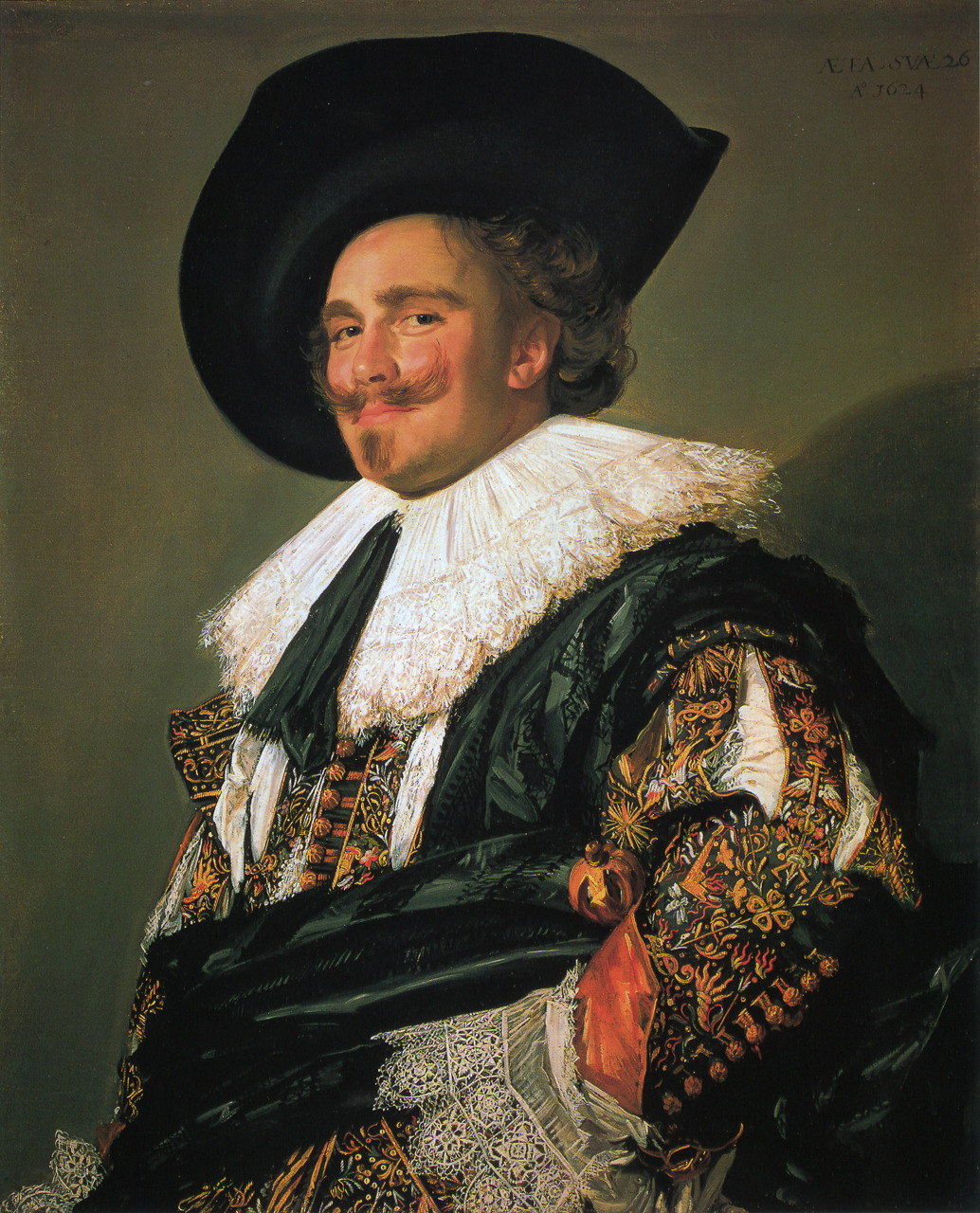
The Laughing Cavalier by Frans Hals
The Cavalier's direct gaze and stance seems to create a confidence within the painting, even thought the painting is titled as 'Laughing' I find that the Cavalier looks more like he is smirking. Hals also uses a plain background which slightly enlightens around the cavalier creating a slight halo alike what I have done with my own painting with the girl with birds in her hair. Hals also suggests a shadow coming from the cavalier which gives more of a form to the backdrop rather than keeping it plain.
Titus, the artist's son by Rembrant
When viewing this painting in person it looks as though Rembrant paints his portraits background first, the continues to build up from the background of the painting to the foreground building up the persons face and figure. Rembrant creates a flatly painted red hat contrasting with a painted face that has been built up by scraping the paint over to create shape and form which then contrasts with bouncy, swirly painted marks for the hair. By doing this he has used may painting techniques together which then brings the painting together well rather than painting the whole image in the same painting style which is what I have done with my own portraits alike Rembrant has.

Rembrant Self Portrait
I found again there was a big difference seeing this painting in person as it is difficult to see the paint work and techniques via imagery, but when viewing this portrait in person I noticed that Rembrant had used the scratching effect in his hair alike his younger self portrait.

Dead Birds by Melchior de Hondecoeter
It was interesting to see another painter appart from Jean Baptiste demonstrating dramatically hung dead birds. I enjoy how Hondecoeter has used more props within his painting where the birds are carelessly hanging from.

Tate Modern
Lichtenstein - Look Mickey
It was interesting to see the paint work on Lichenstein's canvases because his use of bold and bright colours, however when viewing this painting in person, I could see pencil marks left on the canvas and could see rubbed out marks pencil marks under the oil paint.

Lichtenstein-We rose up slowly
Lichtenstein painted onto two separate canvases to then exhibit them together as one piece within a panelled frame, I think this is an interesting way of displaying your work.

Lichtenstein - Portable Radio
In this piece is another example of working beyond the canvas by changing its purpose and using it as a prop within other art work to create a full form.

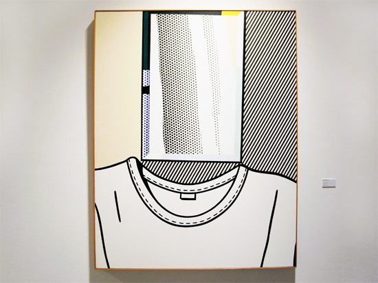
Lichtenstein - Self Portrait
Unlike other artists Lichtenstein portrays a self portrait of himself with no human head instead he displays an empty jumper with above where a head should be a piece or paper or canvas. This may be a statement from Lichtenstein of telling the viewer that he is the art.
Jannis Konellis - Untitled 1979
I found it really interesting to discover some of the meaning behind Konellis's piece, "The two birds, a jackdaw and a hooded crow, have been seen as symbolising the death of throes of imaginative freedom".

Pablo Picasso
In the image below I was more interested in the display of the painting within the chunky wooden frame.


Francis Picabia - Otaiti 1930
I found that there were some really interesting qualities in this painting as Picabia has used oil paint and resin on the canvas, he also overlaps his images which makes the viewer keep looking in depth at the painting to depict any more forms within the painting.

London Overall
I found that the trip to London helped a lot with ideas for when I take part in the group exhibition as I was able to look at a range of different artists work and see how they displayed them, titled them and also look at their technique and paint work with my own eyes. I found that a lot of the artists paintings I had been looking at through books or other images I found looked very different when viewing them in person and there were elements that isn't noticeable with photographed images of the work.
No comments:
Post a Comment