Tuesday, April 16, 2013

Paintings 15/04/13


I have began two paintings today and technique wise I have let the painting just happen and haven't specifically set out to paint the image in any intentional way, which has allowed some really exciting elements to happen. 

The painting below, I started by painting the skin tone, I thinly applied the paint where I found that the background worked well with the fleshy tones, with this I  immediately had a base colour which helped to create an over all skin tone. When coming to do the eyes and the inside of her mouth I liked the idea of keeping them blank, as I am working with the idea of depression and anxiety I thought that the blank eyes worked well as the woman's eyes are empty because she has no spirit or life within her and her mouth is blank because she cannot speak because of the difficulty to talk to people about feelings. Her body is naked in an unsexual way as it represents that she is vulnerable. I am currently debating whether to fill in her hair fully instead of an outline as I already have suggestive lines and shades on her chest, her face has a variety of light fleshy tones and with her hair being left with only suggestive lines I worry that the image has become unbalanced and too thinly painted. 


Below is an unfinished painting of a woman which when I finish I will paint it with two birds on her head, the birds are normally a symbol of freedom, however the birds wings will be clipped  so they cannot fly away because they are showing that the woman is trapped within her head hence why the birds are specifically placed there and bound to her. Her gaze is looking down because she cannot look at the viewer because normally when people lie they cannot look at the other person to tell that lie, this is the reasoning behind her gaze because her whole image she is portraying is a lie because she is pretending to be a person she is not which is what a lot of people who suffer with depression tend to do. Her eyes are empty alike the previous painting as she has little life and or spirit fighting within her. Her clothes are drawn on in lines and drips which after looking back at the image in progress it seems to really work as it balances out the heaviness of her hair. I think I now need to think very carefully on how I am going to paint the birds to make sure that the image stays balanced.


I found when painting the women that I originally painted their lips a pinky shade similar to the original image however when painting them I found that looked unnatural as though they had bigger lips than before and it looked too bright. I found when repainting it that a natural tone was much more effective as the general facial tones worked well together.

Both images have a cracked canvas base as the women are portraying a painted image in front of the viewer and she puts on they put on in front of others however underneath the image she is  cracked, damaged and hurt and internally suffering.

I want my images to still be beautiful because people who suffer with these aspects are still people and are even more special as they are brave enough to be able to pretend to others that everything is ok and don't want to drag anyone else down with their internal battle.

Sunday, April 14, 2013

Plans and Ideas 14/04/13

I have been doing some planning for the next few weeks and after doing so much research and written work I am dying to get back into the studios and painting again, so I am going to draw out two more canvases tonight. Each of my paintings I want to have a concept and idea behind it and not just painted without any meaning behind it, as I have prepared four canvases and I haven't painted on any of them so far I haven't planned everything to the T, as I don't know which or how many I will be putting in the exhibition or even how I am going to paint them. I have studied so many artists different work and ways of painting things that I have been influenced by so many, but because I have been emotionally struggling over the weekend I think that at this moment is the best time for me to be painting without any planning and just do it and paint it and see how my emotions relate to the paint. I don't want to copy another artists work because I want to be able to create my own painting style and technique with the guidance and influence of other artists.

As I am visiting the Blank Space on Tuesday I have been thinking in advance how I would like to display my painting/paintings and I have come to realise that I want to do something different, I don't want to just hang my painting/paintings on a wall, I want to display them differently and there is so many ways of doing so
eg. hung by chains, bending wire to clasp a painting, hung by string, displayed on shelves. But after having a lot of different ideas, I thought what meaning do these have, chains would be a good idea as they are strong, sturdy and are a way of imprisoning people/items, however I preferred the concept of using a shelf as they are a more subtle way of displaying and will work better with the paintings idea of not being so littoral which by using chains this would have done. With the shelves they have the idea of being forgotten, and more of a hideaway place alike items that are put away on the shelf and forgotten about, with how I feel a lot of the time is that nobody cares or has the time or realisation of what I can be going through when I get so down or anxious, they will pass it off as nothing as it is easier for them to deal with. So now I have the opportunity of thinking what materials I want to use,

Recycled materials - shelf made from a radiator sections, fridge sections or corrugated iron.

Wooden Shelves-  could be made from - planks of wood, sawed off sections from a tree, new shelving pre-made.

On the shelves with the paintings I could varnish on flowers, leaves, stones, hair, feathers etc and make the shelves part of the art work.

These are still ideas to be confirmed after doing some research and seeing how they will look with my paintings. I think when everything comes together its good to have a few plans but it will all be down to my visual eye and how things look. I am also excited to see what other peoples work will look like to see how my work will fit together with it.


3rd Year Exhibition Opening Night at Picadilly Unit 4

These are a few images from a 3rd year fine art sculpture exhibition curated by Joe Orr. It was interesting to see a different set-up in a warehouse space to exhibit work instead of just the usual white walls that art work is presented in galleries. I think that their sculptures worked well because of their style, I think they would have looked out of place in a white walled gallery, so their pieces worked well in the space they used. It was also interesting seeing one of the artists using the instillation of the building to present their work (image number 6). 

I think for my work within an exhibition would work a lot better on white walls as I want the main focus to be on my work only and for it to not blend into the building features.

1.

2. 

3.

4.

5. 

6. 

Louise Bourgeois and Eric Fischl


Louise Bourgeois
St Sebastienne, 1992.

I've come across the artist Louise Bourgeois who's sculpture piece Sainte Sebastienne (1992), here she responds to the arrow shooting of Saint Sebastian, she represents the figure in pink fabric as well in a female bodily form. I'd like to learn a lot more about her work and concept. 

Her work seems to represent sexuality, loneliness  anxiety and has expressed this through her sculpture, prints and installations. I have only been able to find information via the internet as I am waiting now for the books for Louise Bourgeois to become available in the library. 


Eric Fischl


I have been looking into Eric Fischl's work which I have found to be rather interesting as he uses his painting's composition and display of imagery to create narrative which gives the viewers a feeling of depressive anxiety. I find this way of creating a feeling for the viewers via the imagery and painting detail before them to be a very exciting and interesting element to be able to create an emotion, which can become a large variety as different people will respond in their own individual way making the painting have a different context each time it is viewed.

Francesca Woodman


After reading Charlotte Perkins Gilmore's novel the Yellow Wallpaper, I have come across the artist Francesca Woodman who's work has really reminded me of the novel and I have become extremely inspired by her work and even though it is not via the same media as myself and it is through photography  I am so excited about her work, the images, the layout, the concept and the power within one picture. After getting a book called 'Francesca Woodman' edited by Corey Keller, it showed a range of her work from different exhibitions. Some of her images have a eeriness which can be haunting and somewhat disturbing however I find I can really relate to her work as before I read anything about her I simply just looked at her images I found them very overwhelming and they created a range of emotions when viewing them, starting from myself with fear, anxiety, empathy and understanding. Each of her pieces tell me a different story, after finding out more information about Woodman, I was very sorry to hear that she committed suicide at the age of only 22.   To me her feelings she may have been feeling before doing so come across very strongly within her work and  not only does she seem to be expressing her emotion she also looks as though its a cry for help to somebody or even anybody.


The image below I find is very similar to what I'd imagine from the novel yellow wallpaper would look like if it had images, I find that there is something quite elegant and beautiful about this piece, I personally feel at ease viewing it however I do question the composition and image but I find the image before me to come across as being quite shy, I'm not sure if this was the effect the artist was trying to create but I like how I may also take a different aspect onto the image when I relate to it myself.

1. 

The image below I find to be very frightening and scary, it also make me feel very vulnerable  as not only it there an image of a woman moving behind the fireplace but the room itself it run down, uncared for, falling apart and the angle of the fireplace I find naturally when looking at something isn't quite right.  I question firstly is the state of the room an image of how the artist was feeling? Unloved, unwanted and falling apart? And then there's also the eery image of a woman not only moving swiftly underneath the foundations of the fireplace but also she is sat down, another aspect of the image I question, why is she sat down? Is this another aspect of a vulnerable position, to be low and discrete as she scuttles away from the camera  like some kind of animal? The idea of a human behaving like an animal has a scary aspect within itself as for humans to see other humans behaving like an animal it is something largely un-normal and very frightening as within the community and civilised world we are in now, irrational animal like behaviour is not something to be seen and I find this image really scares me and I think not only because of the aspects that have been mentioned, it is also because I don't think I understand it and the unknown is a very scary aspect even for the bravest of people.

2. 

The image below even though a similar concept of a person emerging from the wallpaper as it does in  image no 1, the effecting result is completely different, unlike no 1 which has a form of beauty and fragility about it, the image below is more similar in no 2 which is scary, it may be because images such as these which are presented within a room remind me of those moments of fear as a child, thinking that something is in the room and the fear of harm from an unknown character that you fear will come for you in the dark. I find that this thought has made me realise that the fear is more the concept of vulnerability of the unknown. The shattered objects on the floor may also be some sort of statement that the body coming from behind the wallpaper is coming not only with some form of force but could be coming with anger and violence from the suggestion of destructed items.

3. 

4. 

5. 
In the image below I think the person within in is demonstrating very literally the concept strain. The arms pushing against the wall begins to show a form of strength but when looking at the bodily composition and the head position, the person is starting to form a fetal position and the stretched out arms become apparent that the person is beginning to bow down to the strain. I also really enjoy the fact that Woodman has hand written text underneath her photograph as even with text it doesn't explain exactly what the image is about. 

6. 

The image below when first viewed with the laced garments on suggests that the image is about seduction however after looking at the image again I realise that I interoperated that it suggests otherwise, firstly the angle of her body and the way she has positioned herself is awkward, her legs are angled uncomfortably towards the floor which will be putting strain on the rest of her body, however this is the position she is lay in also  makes me question why this is so? She is facing away from the viewer holding her arm around herself, this bodily position gives the impression that she is maybe upset or even crying, the fact that she is in lingerie suggests that the meaning of her upset may have been created from a male influence. The image seems to come across to me as a suggestions of dismissal, what I have interoperated is that the idea of wearing the lingerie is a way a woman to feel good about herself and her body but also it enables her to share that with a man, as underwear is something to be sexual but also the concept of having sex is a way to feel loved and close with somebody who you care a lot about and the same in return. This image does not come across as being sexual because of the dismissal she seems to be experiencing, I interoperate the meaning of this image as being very vulnerable and also a feeling of to be wanted.
7. 

The image below I find to be interesting, again without the girls top on I find Woodman's work to be unsexual and more a concept of being vunerable. The angle the woman is shown, it looks as though she is bound, it makes me wonder if this image was about Woodman's feelings as though she may have been trapped or unable to get away from her own problems.
8. 

9. 

10.

This image of the naked woman does not come across as being sexual to me, I find it represents vulnerability  she also looks as though she is trying to clutch tightly onto something as though she may be about to do something irrational or it could be a form of anxiety

11.

This link below I found a New York Blog about her work and I found it really interesting seeing someone else write about her work and their interpretations about it. I find that what I have written about her work I have looked more at the emotional side and questioned her layout and stances as being a statement or even a cry out for help for people to notice what was going on underneath in her mind.

http://newyorkarttours.com/blog/?p=1048


After analysing Woodman's work I have been very touched and upset at the thought of her committing suicide at such a young age, and this made me think of life in general. As my work is to do with anxiety and depression I know the feeling of suicidal thoughts and it is a very scary process to go through on your own and hearing of someone else with another form of artistic talent where they have attempted to express within their art work rather than expressing vocally and haven't found any help.

After thinking of putting my paintings on shelves as a form of statement, I was thinking about the concept of life and death and how short and precious life can be with so many possibilities which when suffering from depression you can become very narrow minded and struggle to see to the world around you. I currently have an idea of having dead flowers on the floor underneath my paintings to resemble how life can be so short and easily destroyed, like a flower being so fragile. My idea is not only to have the flowers symbolising life but also to maybe either tie or sew them together to show also the complications and also problems that are difficult to overcome which can leave you feeling tied with little choice to challenge or defeat them concluding in defeation within yourself.
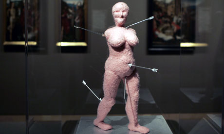


Friday, April 12, 2013

Creation/Destruction Exhibition at The Holden Gallery

I visited the opening night for the exhibition Creation/Destruction on the 11th of April, I have found since getting ready to take part in an exhibition I am now looking more in detail at presentation of work when visiting other exhibitions. 

Below is Anya Gallaccio's work, this artist explores the connections between decay, time, materiality and contemporary aesthetics. Decay is a vital part of her show and she presents her work on glass to appear as though the work is viewed as though in a museum. I like the idea of presenting a sculptural piece of art on glass however this idea I don't think would work as well for a painting and even if I did try I don't think it would link as well with the ideas I have so far with my paintings.


However after seeing this exhibition I questioned how I wanted to present my paintings, do I want to present them on a wall alike many other paintings, or can I think of a different way??
I have an idea at the minute of presenting my painting/paintings (depending on how many I exhibit) to present them on wooden shelves, my idea for this is the shelf becoming a statement and part of the art work, the statement being how with depression you can not only feel as though you are on the outside but as though you are isolated, so the idea being as though the painting is placed on a shelf and forgotten about alike many objects I own and a lot of people also do and put things away and forget about them. As thoughts in advance I like the idea of placing the painting and shelf on the wall quite high up as though the painting is trying to get away from the viewer because when struggling with depression and anxiety I find I personally tend to try and hide away from people and I want to be able to find a way to portray that not only in the images but in the layout and presentation of my paintings.


Below is Rut Blees Luxemburg's 'The Pattern of the Plans, 2004' his images often reveal unnoticed and overlooked elements in public spaces of the city and its nocturnal backdrop. For creation/destruction some of his works also move away from the urban into subjects such as iconoclasm and materiality. Themes of decay, destruction, erosion and ruination apprear frequently in the artist's work. 


The cracks within Luxemburg's image 'The Patterns of Plans' I found I related to as my own ideas with my canvases as I have purposefully similar cracks within it. What I find interesting is the reason for my canvases look was to be representational of not only the strains and stretches on the corners alike stretch marks formed on women's skin, I also intentionally created cracks within the middle where I wanted to create an all round effect of strain and cracks underneath a stable image, as I want to create an illusion of the image on the foreground that I show to everyone who thinks I am stable and there is nothing the matter where as actually underneath that painted image I put on the foreground there are a lot of cracks, strains and upset underneath.

It has been interesting to see a contemporary artists with cracks as an image as I originally liked the idea of the cracks from the old master's paintings such as Memling, Holbein, Oudry etc where the oil paint has gradually started to crack over years of the paint eroding, where as I want to recreate an instant cracked  effect by creating the cracks and strains myself through materials and force.

Comparing Artist's Work

Over the past few days I have been researching into a range of human portraiture artists and animal artists, within this range I have tried to find not only 1500 - 1800 artists but also contemporary artists and I have been surprised to find a lot of similarities between them and how even some of the contemporary artists strive to still create an effect similar to the old masters and others seem to shock or create statements, concepts or even make the viewer question their work. All of these are interesting factors and I find it really exciting bringing it altogether!!


From the Book Degas' Drawings I came across this image A. Portrait of a girl. Ca. 1863-65, I found this image has so many exciting elements, firstly the browned background also what I want to portray my figure on when painting my portrait. I am also interested about the  detail  on the face  which slowly decreases down the body to the shoes to finish with a simplistic inked line drawing. I found this effect to be a similar effect to Michael Borreman's 'Girl with Feathers', however Borreman's piece is more simplistic with less detail and background unlike Degas' which has a busier composition

Again I came across another similarity in Degas and Borreman's art work with their sleeping images. This time it wasn't the use of line that made me realise a similarity but it was the detail of the face where the two artists have worked into and leaving the detail of the body to become unimportant. I have been really inspired by the simplicity of their pieces of art work as I have come to realise that a fully painted image may not always be the more effective and simplicity can sometimes become a more powerful image overall.


The image below is from the book, Jean Clouet Complete Edition of Drawings Minatures and Paintings By Peter Mullin, it was interesting to learn that Clouet learned some of his drawing technique from the Italians and was one of the first artists in France to understand the Italian High Renaissance. These images are by different artists who began to have a similar style to Clouet. 

The top two images were drawn by Hans Holbein using chalk on paper, it is thought that Jean Clouet and Holbein crossed paths when Holbein was travelling and this may be where Holbein got his technique from, however I find Holbein's drawings to be more simplistic with very little shading and more lines. 


The bottom right image was drawn by Francois Clouet, which has more detail in his chalk drawing but the face is drawn very delicately and his mark making is very subtle alike the painting 'Portrait of a Young Girl' by Petrus Chistus 1470what I find amazing about this piece is how delicately the girls face is painted, with little amount of colour and the used colour is very pale and light.  

Portrait of a Young Girl by Petrus Christus, 1470

Below are two images which I have interperated to be battling with oneself, I want to compare two contemporary artists, on the left is one painting from 10 called Batteling Inner Demons by Emanuele Ronco and on the right is The Case by Michael Borreman. Firstly the naming of the paintings are completely opposite in the way that Ronco's is very littoral to what his painting is about where as Borreman's is unlittoral in the way that the image does not resemble the exact title and is more questionable to the viewer. Within the images themselves, Ronco's is very bold, upfront and the portrait of the man seems to float within them image as his features stand out from the black background, also his intended meaning for the image is very littoral and obvious of what the painting is about so the viewer has to do very little questioning on what the image is about. Where as Borreman's painting 'The Case' is subtlety painted with complimentary colours to each other, the image compositionally works well as there is no floating portrait and the image itself is well balanced with its layout. Borreman has not painted his image as litterol as Ronco's and has used suggestive lines with his paintwork and is a bit more sided towards impressionism.


Below are two art pieces, on the left is Jean Baptiste-Oudry with a piece called 'Nature morte avec oiseux et cerises' and on the right is a painting by Michael Borreman, I have chosen these paintings to study as I will be painting birds within my portraiture and I wanted to find some artists that have painted birds. I wanted to see how powerful an image of an animal can become and is it only a portrait or can it have a meaning?

On left Jean Baptiste-Oudry represents two dead birds, he achieves a sense of depth within the shallow space, he creates a busy composition forcing the viewers eye to move around look to understand what is happening within the image. After seeing two different positions of how a dead bird can be demonstraited I think that there is something more monsteroutive and cruel by hanging the bird up by its leg, and I think this creates the image to become more powerful and represent a larger statement.

On the right Michael Borreman has painted two portraits of two singular birds, even though these birds are well painted animals, I find after looking at Oudry's work that these portraits seem quite boring to look at as there isn't much going on within the composition of the image and I question a bit more why Borreman has painted them unless they were  to be a study?

These paintings have helped me realise how I want to be able to compose my paintings not only to make them compositionally interesting but also how to make the paint work and ideas behind my paintings to become visually exciting, I have become tired of creating work what seems to be pointless and paintings without any meaning


The painting below by Hans Holbein and the image of the bird within the portrait has been painted within a different concept compared to Borreman and Oudry, the bird within Holbein's painting is representational of the family name of the woman. I am really excited about the idea of having the animals along side people within a portrait and the animal becoming representational towards the person, this is an idea I will be keeping in mind within my paintings.


Below are two paintings, starting from the left is Hans Memling a 1400's painted and on the right is a contemporary German artist Dawn Mellor. It is easy to see that these is a massive contrast within their work,   the difference in realism as well as the concept behind them. Memling mainly painted religious paintings or realistic portraits, his paintings were mainly at that period of time a way to record images of people as unlike contemporary artists they didn't have the technology to have  a camera. Memling uses a range of naturalistic colours that subtly blend together creating a realistic and beautifully painted portrait. Where as Mellor's painting style is completely different, she uses harsh lines and brighter colours, her work is less realistic but it demonstrates a statement within her work as is quite obvious at times with writing in text. Her work comes across to be very shocking and garish and creates a very strong statement, but I think when viewing quite a few other artists that by painting so littoral isn't always the most successful within my eyes, I do like how you have to look into Mellors work after finding that the image is confusing to have to look in depth to understand it, however I find that the imagery can be too obvious and unlike Michael Borreman who is also a contemporary artist, I find his work much more pleasing to look at and also more questionable and beautifully painted with more of an element of skill which is something I am interested within paint work.


Tuesday, April 9, 2013

John Currin and Jean Clouet


Even though John Currin and Jean Clouet are from different Century's I saw a similarity within their richly painted orban colours, there is more of a husky browned background on Clouets painting where as Currin has gone for a bolder black. I have to say I much prefer the browned background as it is less harsh on the eye, however the blackened background on Currins draws the eye more the the person within the foreground creating the viewer to focus on the person rather as a whole painting.


 Clouet

Currins

Friday, April 5, 2013

Practising Painting a Portrait and Nightingale


I have been having a quick practice on painting a portrait as I have never done one before, I think for my first one I have been finding my feet a lot and the eyes I found especially difficult as I have never struggled before when painting animals eyes, however the eyelids and eyelashes seem more tricky with people. I also found myself trying to paint her skin like fur and I had to think about smoothing it out a lot more. I found myself getting carried away with the paint and painting quite thickly again as I found it easier, but now I have an idea and a starting point with a portrait, I think it will become much easier the next time I paint one especially because the image I was looking at for this painting was in black and white so I had to decide the colours myself.

Again the nightingale is a practice painting, even though I have been used to painting a lot of animals I have mainly painted mammals and have only ever painted one bird painting before this one, and find them more tricky. 


In a way I'm quite excited about painting something really out of my comfort zone as well as being quite nervous too, I think it will be really interesting to see how it turns out as it will be very unpredictable and may not even look how I imagined it to.

Wednesday, April 3, 2013

Canvas

I have decided I wanted to make a canvas for my work to be displayed on as I have previously used wood and a browned surface but because not only am I having an experience I am new to in my normal life I thought why not do the same with my art work and throw myself in the unknown materials, so for the first time I wanted to make a half chalk gesso ground properly and there are a few reasons for this, firstly I like a smooth surface to work on hence why I like usually to work on the wood rather than rabbit primed canvas, but a lot of the time I like the features of the wood in contrast to my paintings and I did not want this effect for the specific project I have given myself and didn't want the background to be part of the focus of the piece but I still wanted that browned effect without having to use paint to do so.

I have previously used a whiting chalk ground where I added hardly any linseed and hardly any layers and had found it soaked up a lot of my paint but at the time worked well with the waterfall features I had created.  But at that point I was guessing and trying materials. This time I got some advice of other students that have previously used it, after stretching my canvas's I applyed 2 layers of rabbit skin glue and the made up my half gesso ground and kept applying slowly as advised. However I came across a hurdle where I had appyed my ground too thickly and the corners had began to crack, I found advice off a tutor where I sanded back my canvas and and re- applyed to create my smooth surface again. I then realised after the previous mistake I had made that I actually liked the effect of the surface cracking mainly because of the unexpectency but also the reason it had happened and that was because of the strain being appyled to the canvas being pulled too taught creating stretch marks which was so exciting because unexpectiantly without realising my canvas had actually given me something that relates to the image that was going to be painted on the, the strains the anxiety and depression have on me mentally can be overpowering and tireing. Not only that stretch marks are also something that unfortunately a lot of women get more than men do as they change shape through their teenage years. Its so exciting it has so many links!! So at this point I was sanding my canvases back like crazy to try and find the stretch marks I had tried to cover up, when I sanded it far enough back I again started to apply thick layers of half chalk gesso to the canvas to try and make the marks bigger, when I was happy with it I sanded the canvas to try and make scuffed marks on the surface but after applying another 2 layers of rabbit skin the effects of the scuffed surface were less obvious which I think now suites it better. I applyed the 2 rabbit skin layers to be able to stop the chalk soaking up my paint too much this time.

I liked the effects of the stretch marks in the corners but I felt it needed a bit more to it so I hit the canvases from behind with my fist creating cracks in the surface and pushing them outwards with my fingers guiding where the cracks lead to. I found with the stretch marks and cracks it really help enable the suggestion of strains and how things crumble in my everyday life and I was able to do that without even getting my paint brush out and even the primer of the canvas has suggestion and a purpose to my painting.


Here I have circled in Red the stretch marks made by the canvas being too taught and created by strain from the gesso ground and I have circled in Green the marks made by myself and directing the cracks along the canvas surface.


I have drawn out the idea of the image I want to present, I wanted a simplistic but pretty looking woman looking down with not too much emotion on her face.


I decided to put two birds in her hair as originally I was going to have one but compositionally when I drew it out I decided that 2 looked better, I also wanted them having different stances, originally I drew out the nightingale on the right first where it is quite closely embedded to her head which is very still but is purposefully uncomfortably positioned but the second one I drew out I wanted to be able to show more of the feathers clipped when I painted it  and have it longingly looking outwards towards freedom getting itself ready to fly free.


Below is a video of how I created the cracks and the starting of painting onto a new primer:


I think it has been a good practice to see how the paintings and canvases are developed  as sometimes there is a lot more work put into them than initially realised.

Ideas and Michael Borremans work


Previously before this project I have always painting animal portraits and even though I have decided to not only give myself a challenge of painting a person (which is completely different from painting an animal which I find a lot easier) I also want to keep an element of my original studies this year with animals but I want to now start thinking a lot more about their meaning and what they portray before painting an image of them. So I began to think about my project idea and how do I want to portray my feelings to the viewer? My original ideas were of porcilin doll faces with cracks on them with something hidden under the surface, vomiting demons from the mouth, showing emotions of fighting with ones self, face being taken over by deformity or scales and a serpant being the symbol of a devil,  but I began to realise that my ideas where too obvious and I was very littoral with what I was trying to express. I have had a brief look at Michael Borreman's 'Eating the Beard' as it wasnt availiable in the liberary so I now have it on order, but for the meanwhile I have been looking at his work on Zeno X Gallery and I have realised that subility and suggestion is so much more powerful to create something with a lot of meaning and the title of the piece has a large role to play as I found myself questioning his work and looking into it deeper rather than having the image telling me everything.


MICHAËL BORREMANS
° 1963, Geraardsbergen (Belgium)
Lives and works in Gent (Belgium)


Michaël Borremans - Dominance

Dominance
2011
105 x 80 cm
oil on canvas

Michaël Borremans - The Loan

The Loan
2011
310 x 205 cm
oil on canvas

Michaël Borremans - Eating the Beard

ZENO X GALLERY
Eating the Beard
October 22 - November 27, 2010

Michaël Borremans - The Pendant

The Pendant
2009
60 x 40 cm
oil on canvas

Michaël Borremans - The Case

The Case
2009
50 x 42 cm
oil on canvas

Michaël Borremans - Taking Turns

Taking Turns
2009
dimensions variable
35 mm film, 8 min. 35 sec., continuous loop

Michaël Borremans - Automat (I)

Automat (I)
2008
80 x 60 cm
oil on canvas

Michaël Borremans - Sleeper

Sleeper
2008
40 x 50 cm
oil on canvas

Michaël Borremans - The Gift

The Gift
2008
36 x 30 cm
oil on canvas


ZENO X GALLERY
Painted Fruit
April 26 - May 31, 2008

Michaël Borremans - Crazy Fingersempty>

Crazy Fingers
2007
24 x 18 cm
oil on cardboard, varnish

Michaël Borremans - The Same Fool

The Same Fool
2007
21,8 x 29 cm
oil on wood, varnish

Michaël Borremans - The Same Fool

The Painting
2006
40 x 50 cm
oil on canvas


Thunder
2006
36 x 34,5 cm
oil on canvas

Michaël Borremans - The Filling

The Filling
2005
33 x 28,4 cm
pencil, watercolor and gouache on paper

Michaël Borremans - The House of Opportunity - Voodoo!

The House of Opportunity - Voodoo!
2005
17,3 x 23,3 cm
pencil and watercolour on cardboard


Square of Despair
2005
24,6 x 35,6 cm
pencil on cardboard

Michaël Borremans - First Design for a Square of Despair

First Design for a Square of Despair
2005
29,7 x 21 cm
pencil and gouache on paper


Blue
2005
31 x 49 cm
oil on canvas


The Skirt
2005
70 x 60 cm
oil on canvas


A2
2004
40 x 35 cm
oil on canvas


ZENO X STORAGE
Fisherman's Luck
March 27 - May 1, 2004


In the Louvre - The House of Opportunity
2003
26,6 x 27,6 cm
pencil, watercolor and white ink on paper


A Mae West Experience
2002
16,3 x 20,3 cm
pencil, watercolor and white ink on paper


The (Courmajeur) Conducinator
2002
16,7 x 24,1 cm
pencil, watercolor and white ink on cardboard


The Journey
2002
17,0 x 24,7 cm
pencil, watercolor, white and black ink, varnish on book cover


Trickland
2002
38 x 55 cm
oil on canvas


The German
2002
50 x 42 cm
oil on canvas


The German (part two)
2002
24,8 x 31 cm
pencil, watercolor, white and black ink, mica foil and transparent tape on cardboard


Drawing
2002
16 x 10,5 cm
pencil, watercolor and white ink on cardboard


ZENO X GALLERY
Young and Innocent
January 25 - March 2, 2002


The Table
2001
50 x 65 cm
oil on canvas


The Preservation
2001
70 x 60 cm
oil on canvas


The Examination
2001
50 x 65 cm
oil on canvas


The Pupils
2001
70 x 60 cm
oil on canvas


Slight Modifications
2001
34,9 x 54 cm
pencil, watercolor, white ink and ballpoint on paper


Canardines
2001
22,8 x 53,4 cm
pencil, watercolor, white ink and ballpoint on paper


Manufacturers of Constellation
2001
24,5 x 30,4 cm
pencil, watercolor and white ink on paper


The Swimming Pool
2001
34 x 28,2 cm
pencil, watercolor and white ink on cardboard


The Constellation
2000
100 x 120 cm
oil on canvas


I am fascinated how Borremans use of imagery is not only interesting but the piece becomes so much more interesting when I read the name of the piece because sometimes I have realisation with what the piece is about for example with his piece 'The Preservation', whereas his piece 'Sleeper' it makes me have a million questions and find myself studying every detail of the painting questioning its layout and meaning as I find it could mean so many things. What I also enjoy about Borremans work is the talent and skill behind his paint work and how beautifully and carefully it is painting and it really is a skill I admire and strive the become a similar artist.


After becoming so inspired by Borreman and his use of layout, suggestion and titles of paintings I began thinking of more less litural ideas to be able to express myself, and I remember seeing Borreman's 'Girl with feathers' in his book 'Eating the beard' 

Michaël Borremans - Girl with feathers

I found that I really connected with this image, and his use of faint lines fadeing were very similar to Holbeins that I had been previously been looking at so I found that the two artists from very different times linked really well together. Borremans use of feathers in his painting made me question the meaning of it a lot and I found I couldn't quite figure it, I saw the feathers which I know a bird is a symbol of freedom but did the feathers mean that the bird had gone and that's why the girl was sad? These were my interpretations of the painting.


So with this inspiration I already knew I wanted to paint someone female as my condition is linked to that as it is very rare for men to get it. My idea is to paint a woman with birds in her hair, but the birds cannot fly away from her because they arn't free and are bound to the woman, which is symbolising that it is actually the woman that is trapped within her own head therefore that is why the birds are specifically placed there but I also what the woman to look normal as in a way I do on the outside but on the inside my feelings are completely different.

So with this idea I had a few things to think about, who did I want to paint, how would they be posed, how would the image be composed and did I want every feature to be symbolic

  • I want to find a woman I don't know which I have no physical or emotional connection with, the reason for this is because when I am getting anxious or down I tend to turn into a person I don't really know and turn the opposite and loose a lot of confidence
  • I want her to be looking down and the reason for this is because I don't want her to be looking at her viewer because a classic example of when people are lieing you generally cannot look them in the eye and I want the view to be symbolic of lieing as on the outside she is looking completely the opposite of what she feels inside and I tend to tell people a lot of the time I am ok when in fact it is completely the opposite and I lie to them telling them what I want them to hear.
  • I want to keep the layout very simplistic similar to Holbein's chalk drawings and Borreman's 'Girl with feathers' or 'Sleeper', I want my main focus to be what is in front of the viewer and to have a plain browned background.

The bird in the hair is probably one of the most important aspects of the painting, as that is what is confining her, as I don't want to do demons or serpants or use something as littural I thought what is the complete opposite of that, as I tend the feel imprisoned a lot and the opposite of that is freedom and the bird symbolises freedom, so I thought if I bound the bird it symbolise imprisionment. I began to look on how to bind a bird and I didn't want to get ropes and confine the bird like that as again I was becoming too obvious and littural again, so I have began thinking of things that could be more subtle such as clipping the birds wings, a very minor detail that the viewer would have to look at the painting more carefully at, I am still debating on tieing the birds mouth so the bird cannot sing or speak as a small ribbon tieing the beak may be slightly too obvious but may also be a bit more explanitory, but I am still undecided at this current moment in time. But the main thing that the bird is going to be bound to is the woman.

I now have a few ideas on how I want to display the bird and the woman, do I want the completly visiable or not? When seeing the exhibition of Raqib Shaw's work he explained he put gems on the aspects of the painting that had importance, I find this to be a really interesting idea that I would also like to use in my paint work but not with gems and use something different, maybe a colour, a technique or maybe a different medium or material. These are all ideas that keep cropping up and I find them so exciting the possibilities of so many ideas and suggestions.

I have also been thinking I can't just have any bird and I wanted to specifically pick one out, after some research on the meanings and symbols of the different birds I think I have come across the right one for my subject matter, the nightingale.

Nightingale

Connotes
>>
Good Omen
>>
Cry for help from a poor soul from purgatory

Everyone is awake that the nightingale's song refers to love and longing, what it could also mean is a sign or warning of an impending death. With its natural ability to sing, it symbolizes a creative individual who is unearthing his/her potential. It could also refer to someone who has taken up the responsibility to bring about a transformation or reformation.
(the meaning for purgatory is below)
Noun
(in Roman Catholic doctrine) A place or state of suffering inhabited by the souls of sinners who are expiating their sins before going...
Adjective
Having the quality of cleansing or purifying.

I have highlighted in blue the words from the meaning of the nightingale which I think give this bird the most importance in relevance to myself. Firstly the idea  connotes of the bird being a 'good omen' I feel I relate to because I am still a good person and the connote of 'cry for help' is what I am trying to do with the painting but also the word 'purgatory' I also feel that some of the thoughts I have are bad and wanting to also cleanse myself from them to be able to reform into who I felt I was before a person who was always happy and smiling and I find it very difficult to get over my anxiety at times.